VIII. Instruction layer
The current architecture inserts the instructions about the data directly at the ontology level. The instruction layer includes guidance information on how the user should provide values for each property.
{
  "$type": "instruction",
  "$version": "1.0",
  "$schema": "A01564DBBCB04816A9BFE5FB50723EFD3BBE119E",
  "$id": "DA4B9237BACCCDF19C0760CAB7AEC4A8359010B0",
  "$author": "Andrei",
  "$description": "Provide instruction details about properties",
  "locale": "en_US",
  "instructions": {
    "engine": "Text to speech engine to be used",
    "volume": "Sound volume",
    "rate": "Speech rate",
    "language": "The language to read the text in",
    "slow": "Reads text more slowly"
  },
  "display": {
    "email": "engine=='pyttsx3'",
    "rate": "engine=='pyttsx3'",
    "language": "engine=='gTTS'",
    "slow": "engine=='gTTS'"
  },
  "layout": {
    "email": {
      "w": 80,
      "x": 20
    },
    "rate": {
      "w": 50
    },
    "engine": {
      "w": 50
    },
    "language": {
      "w": 50
    },
    "slow": {
      "w": 50
    }
  }
}
Above we have the instruction layer data model schema, which is a locale-dependent schema. The locale field specifies the language addressing the content of the model entry.
The instruction layer comprises three sets of instructions: usage instructions, display instructions, and layout information. Usage instructions consist of simple text that offers a concise description of the property and guidance on its application within the context of the concept for the end-user. Display instructions, on the other hand, supply additional details regarding the presentation of concept properties on the user interface (UI). Lastly, layout information encompasses directives for organizing and arranging elements within the interface, ensuring an optimal user experience.
Add Instructions/Hints
You can incorporate hints for fields by updating the instructions property accordingly:
{
  "instructions": {
    "engine": "Text to speech engine to be used",
    "volume": "Sound volume",
    "rate": "Speech rate",
    "language": "The language to read the text in",
    "slow": "Reads text more slowly"
  }
}
Hide Fields
In order to hide certain elements from the interface, find the concept for which you would like to implement hiding logic and simply modify the following value in your concept's JSON file:
{
  "display": {
    "<property-name>": "<other-property>=='<value>'"
  }
}
Using this logic, you can hide certain elements from the interface if the value of another property is equal to a specific value. This is useful for example when you want to hide more advanced settings or allow for different parameters depending on what option they choose.
This is especially useful when you join it with defining dropdown lists - the values you list there can affect how other elements are displayed, thus creating a more dynamic and engaging experience. It is also considerate of user to not overwhelm them with too many options at once.
Customize Layout
With the layout property, you can manage the width, height, and offset of input fields, as well as their positions within the layout. This is done by adjusting field layout properties in percentages, providing accurate control over the organization and look of your user interface.
- w - Adjust the field width as a percentage to control its size in the layout
- h - Adjust the field height as a percentage to control its size in the layout
- x - Modify the field's x-offset as a percentage to determine its position within the layout along the x-axis.
- y - Modify the field's y-offset as a percentage to determine its position within the layout along the y-axis.
50%
50%
33%
33%
33%
25%
25%
25%
25%
20%
20%
20%
20%
20%
One column layout
If the layout property is left empty or set to 100, the input fields will automatically occupy 100% of the available space, ensuring they fully utilize the width of the container and adapt to the screen size.
{
  "layout": {}
}
{
  "layout": {
    "image": {
      "w": 100
    },
    "hStart": {
      "w": 100
    },
    "minStart": {
      "w": 100
    },
    "secStart": {
      "w": 100
    }
  }
}
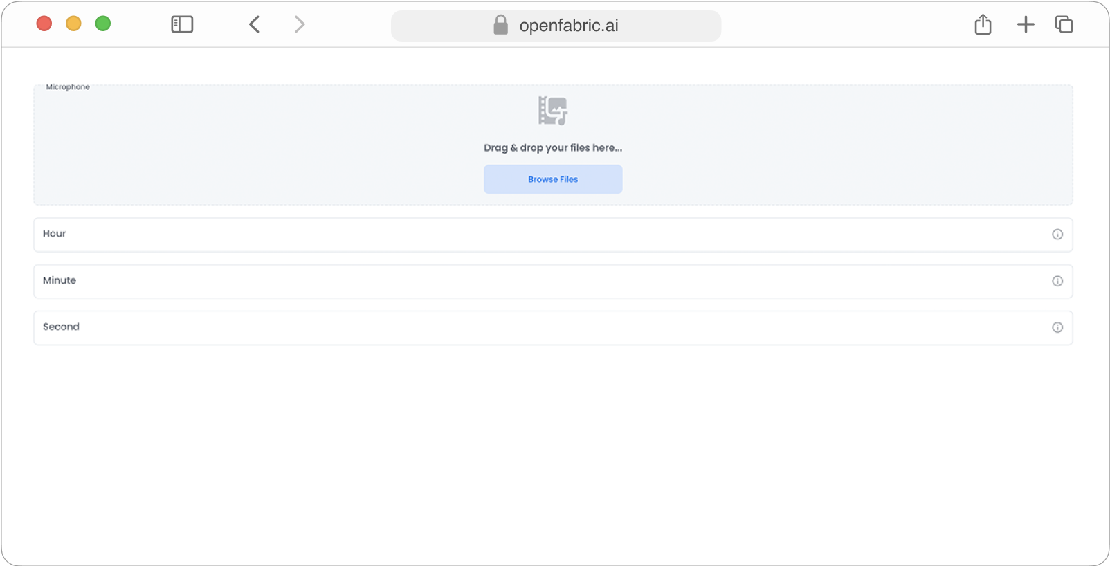
Fig. 13: Full width layout
When the layout property is left empty, the default width (w) size for input fields will be set to 100%.
{
  "layout": {}
}
Two column layout
Using this configuration, we achieve a two-column layout with each column occupying 50% of the available width.
{
  "layout": {
    "image": {
      "w": 50,
      "h": 30
    },
    "hStart": {
      "w": 50
    },
    "minStart": {
      "w": 50
    },
    "secStart": {
      "w": 50
    }
  }
}
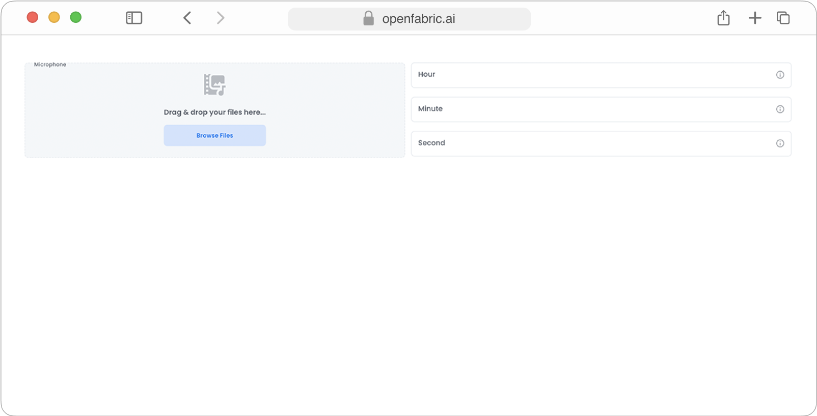
Fig. 14: Full width layout
With this setup, the upload field spans the full width, while the remaining input fields occupy 50% of the available space.
{
  "layout": {
    "image": {
      "w": 100,
      "h": 20
    },
    "minStart": {
      "w": 50
    },
    "secStart": {
      "w": 50
    }
  }
}
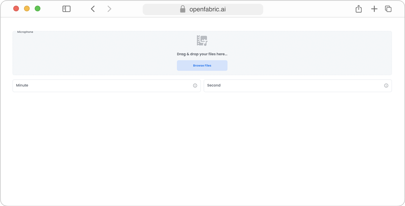
Fig. 15: Layout columns variation
Add x & y offset
Using x and y offset you can control how much space (offset) is left between columns or where the column should start.
{
  "layout": {
    "text": {
      "w": 90,
      "x": 10
    },
    "hStart": {
      "w": 80,
      "x": 20,
      "y": 20
    },
    "minStart": {
      "'w": 70,
      "x": 30,
      "y": 30
    },
    "secStart": {
      "w": 60,
      "x": 40,
      "y": 40
    }
  }
}
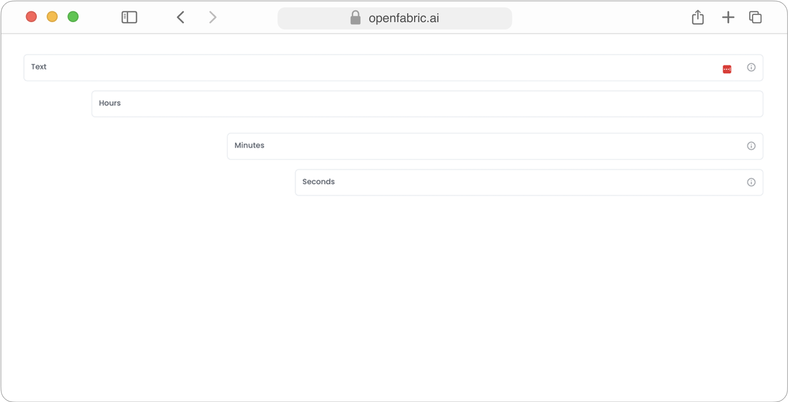
Fig. 16: Layout columns offset & rows
